Posters of the Month: Don't Worry Darling, Squid Game and More
Each month, we welcome a guest from entertainment marketing to write about their favorite newly released posters. Here are this month's picks from Aimo Weichelt, associate creative director at The Refinery. See previous installments of the series here.
Resurrection
Agency: P+A
The poster for Resurrection stands out among others with its strong and bold graphic elements. The retro graphic look is less and less common today and always catches my attention. The modern vintage style is striking and refreshing with its color pop and the entrancing white eye. This definitely stood out to me this month.
Don't Worry Darling
Agency: Bulldog
At first look, I noticed and appreciated the cleaness of it all, the color, the architecture of Palm Springs and the great proportions. But after realizing it's water and not clouds that the plane is trailing behind, I was really intrigued. After I checked out the trailer, I feel the poster is a perfect representation and a great teaser to the trailer and works nicely together in harmony.
I can only recommend checking out the trailer as well, since Don't Worry Darling has a stellar cast and looks like a fantastic psychological thriller. Visually it combines the unique Palm Springs stylized look of mid-century architecture and stylized interior design. Can't wait to see this.
House of the Dragon
Agency: AV Print
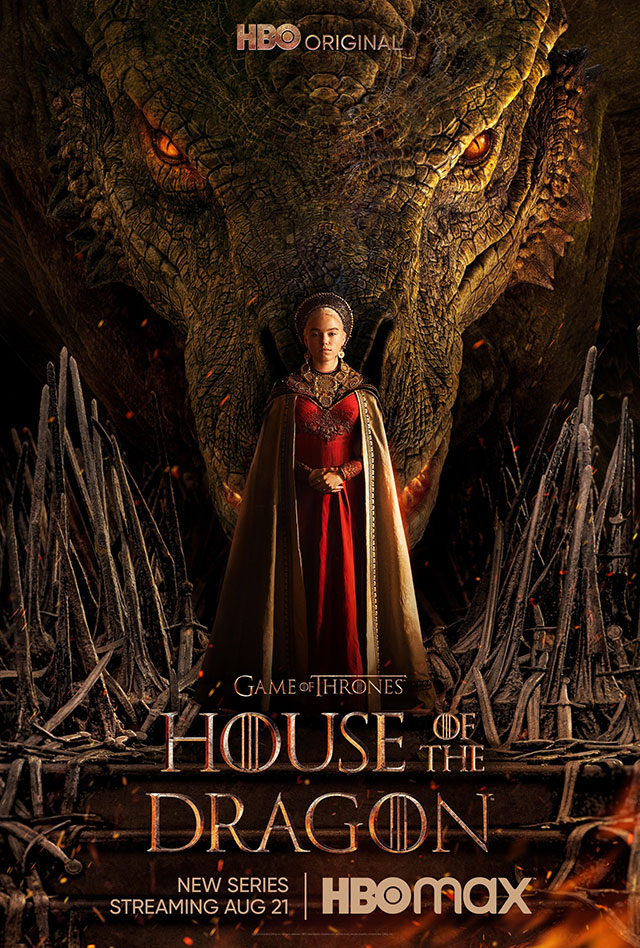
Dragons are back. The long-anticipated House of the Dragon, the Game of Thrones spinoff, is showing some great new art and it goes right to the point of what fans want to see. Big ol' dragon, lady in red, melted swords—or is it the throne? Speculations are running high. The poster has a great strong symmetrical layout and a lot of intricate detail to make this a solid piece of art that I'm sure fans will love and hang on their wall. (Do people still hang posters on their wall? No idea, but maybe they should.)
Smile
Agency: LA
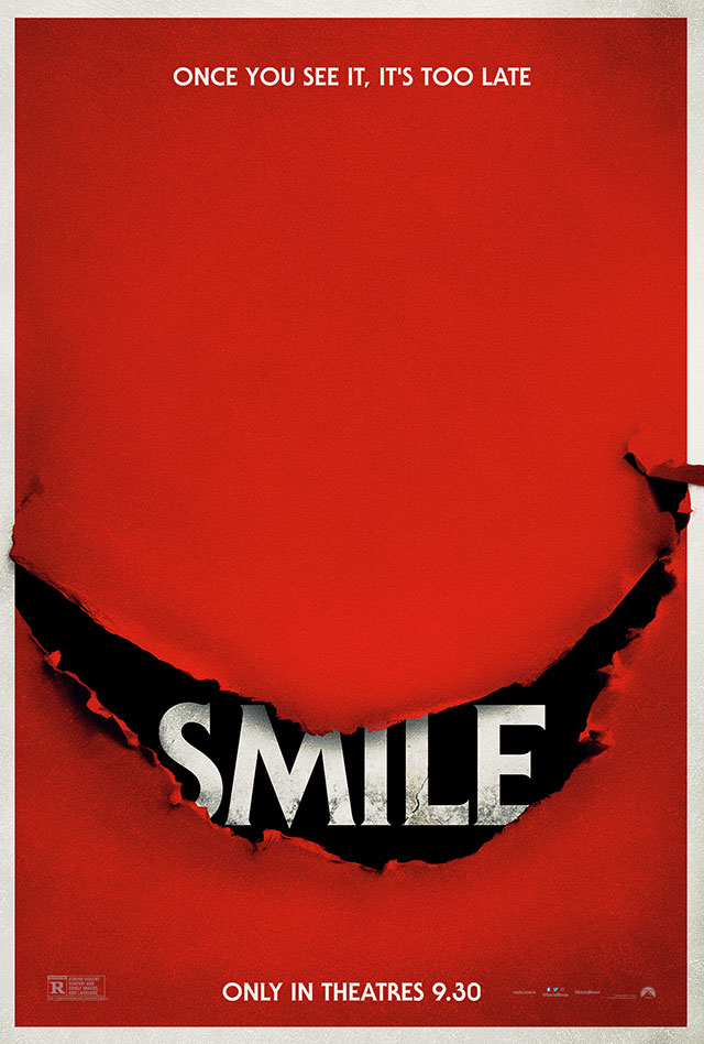
Horror-movie posters often have the benefit to go iconic and play around creatively without restrains. This poster for the creepy-looking horror film Smile is doing exactly that. It is not relying on talent or any full bleed imagery, but instead reimagining the idea of a rip as a smile, and in doing so, it is striking and punchy as well. Its boldness and simplicity are well balanced with a lot of negative space. It will definitely draw you in when you see it on the streets and creep you out at night as well.
Squid Game
Agency: The Refinery Creative
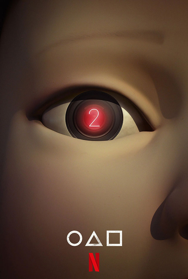
Red Light, Green Light. And I guess it's a green light for this show. The Squid Game phenomenon is coming back, and even though it will take a while, we got an iconic and minimal little teaser to stare at until then.
The super-mesmerizing and iconic doll from the show doesn't need to show a lot to be recognized. The super close-up is supposed to tease, and to not even name the show is another bold move that doesn't happen often anymore. A truly bold teaser.
The show's creator, Hwang Dong-hyuk, said "it took 12 years to bring the first season of Squid Game to life last year, but it took 12 days for Squid Game to become the most popular Netflix series ever." Let's hope it won't be another 12 years, but I know I'm excited to see more of the world he created.


